Type
Director's
Club
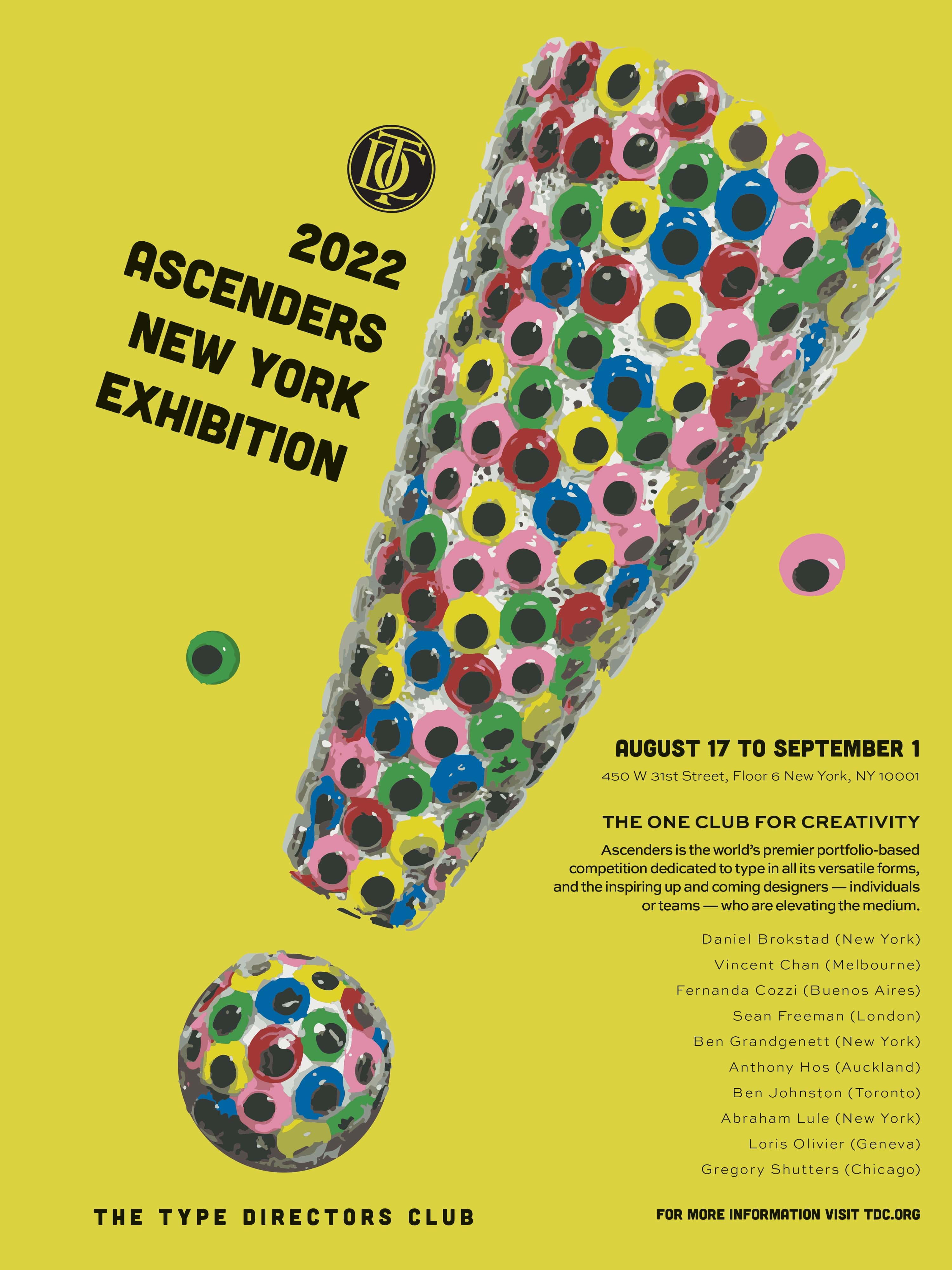
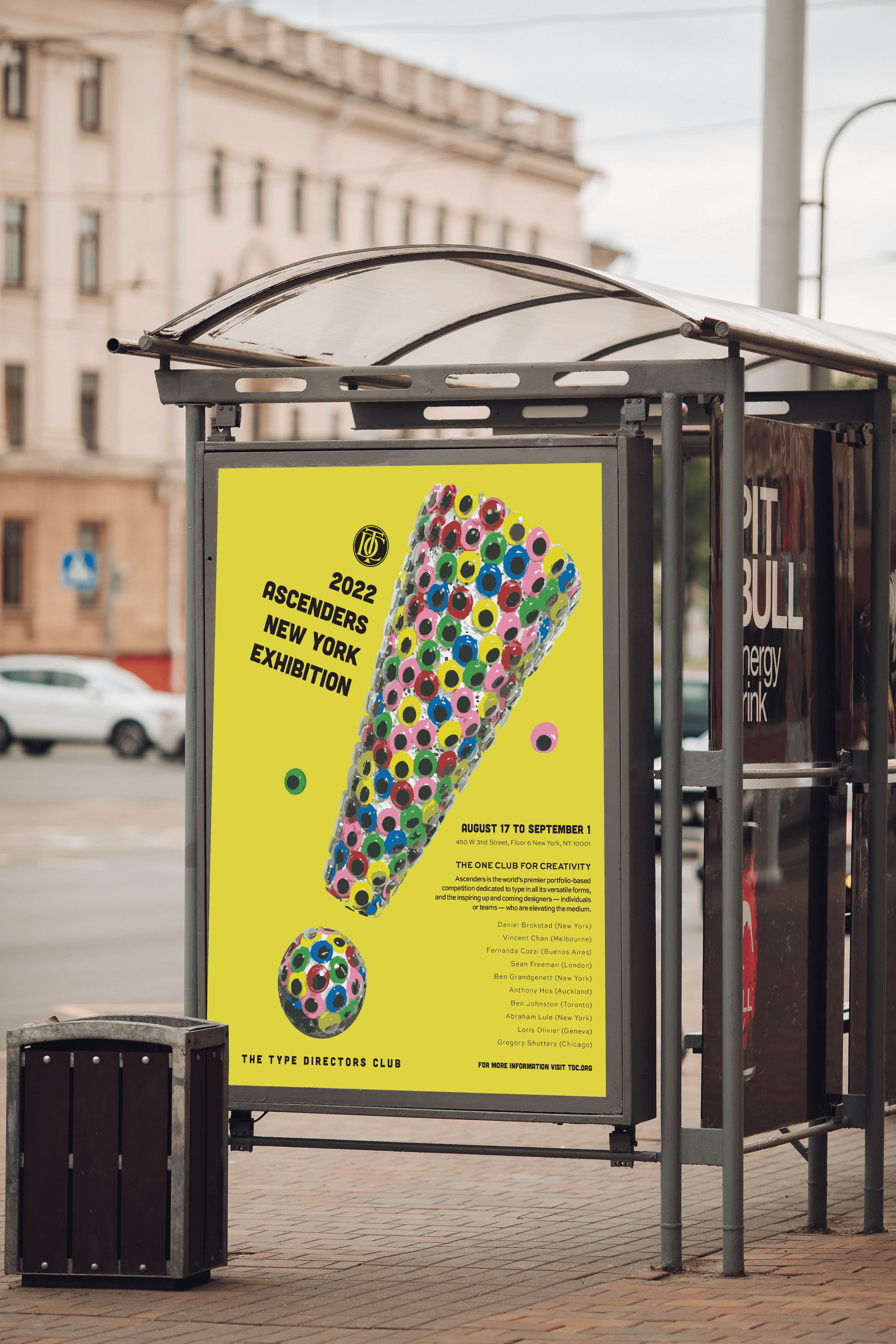
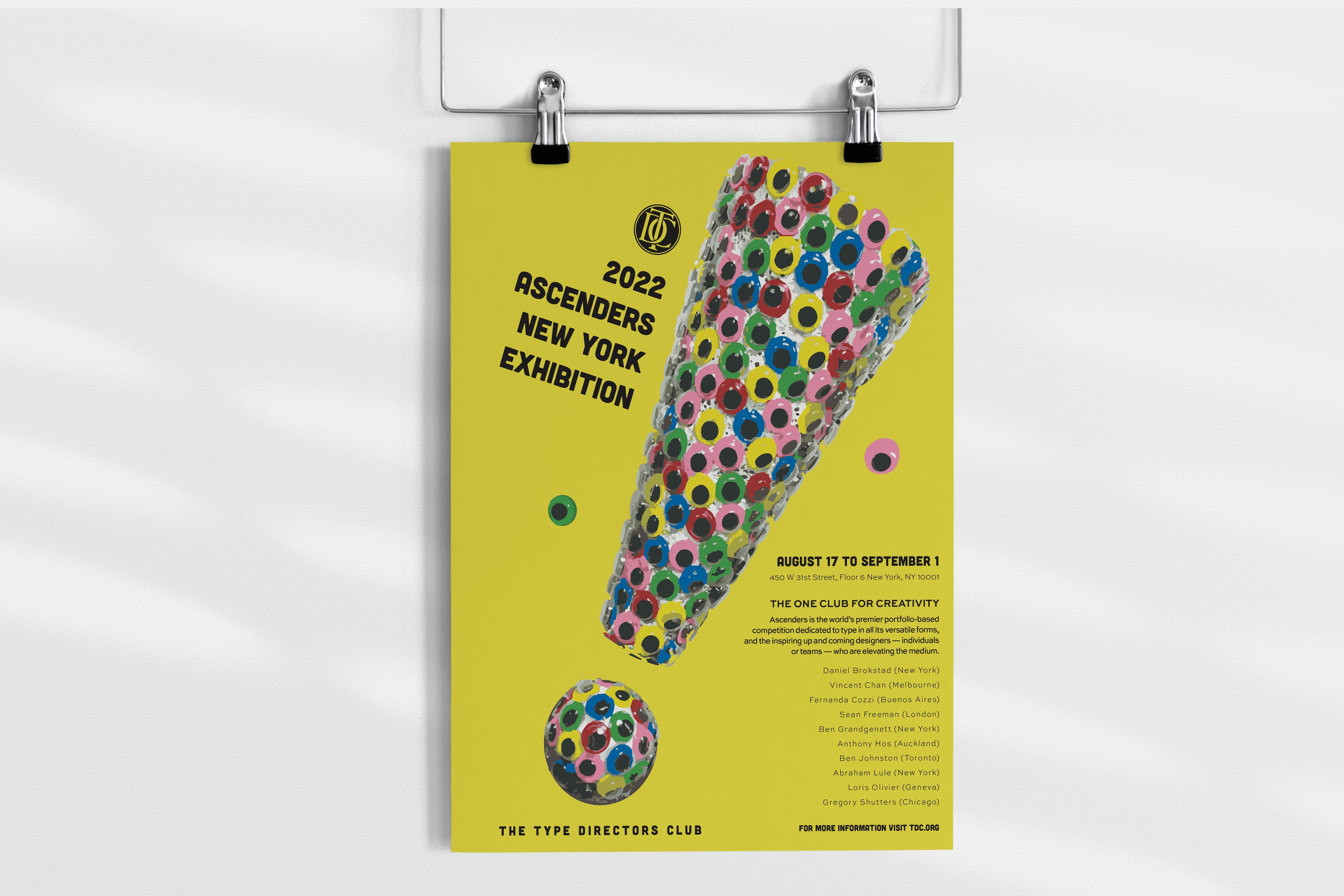
The Type Director's Club is the biggest organization devoted to typographic design. For this project we were assigned a random alphabet or symbol in which we were to design a poster for.
For the exclamation mark, I wanted my design to be alert and eye-catching. I molded the exclamation mark using googley-eyes and styrofoam, then vectorized my images. The use of bold colours helped create a fun and loud palette, which aids in helping guide the audiences eyes throughout the poster.


