Bottle
Rebrand
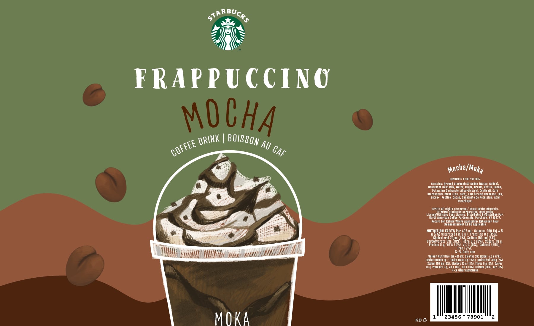
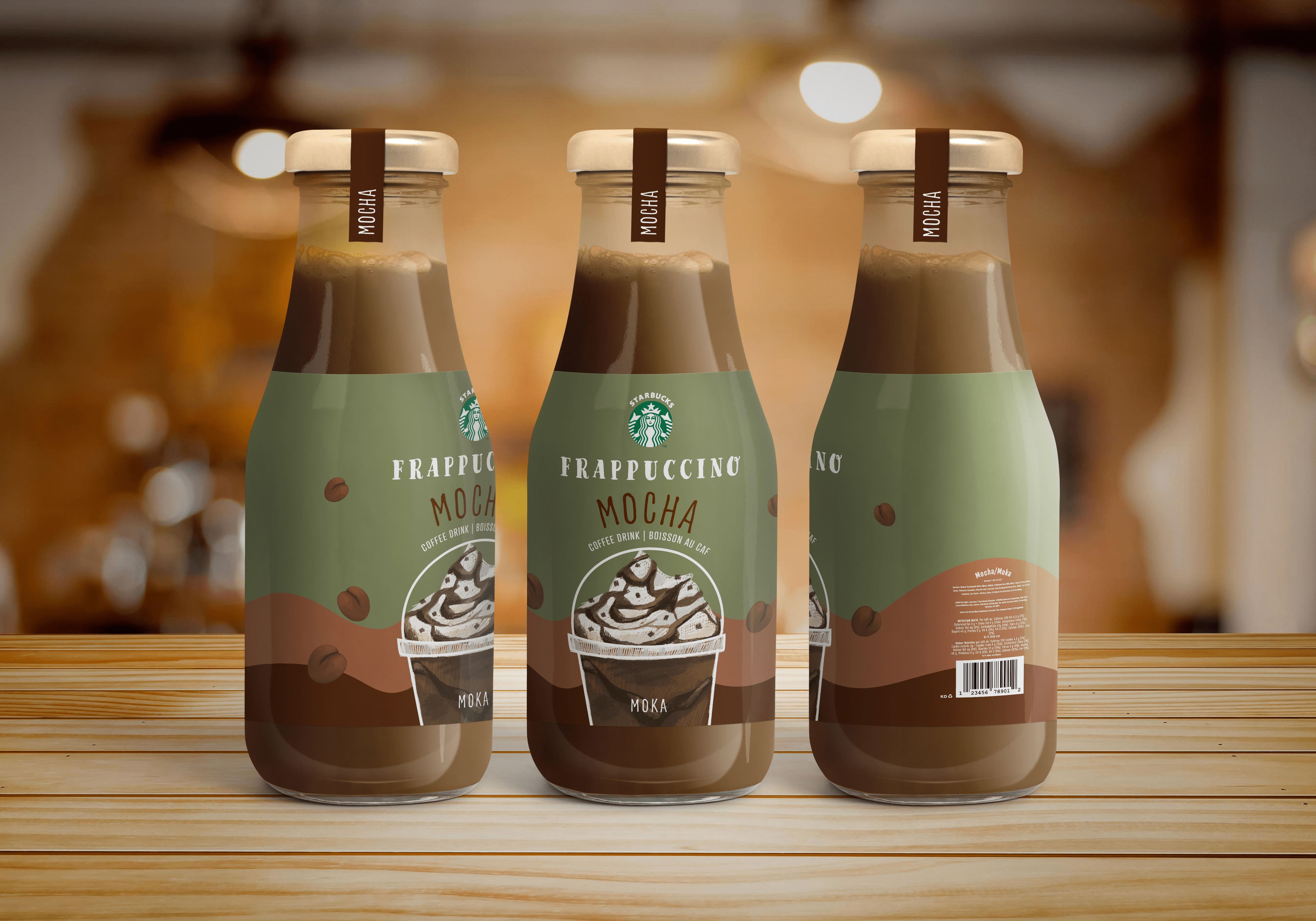
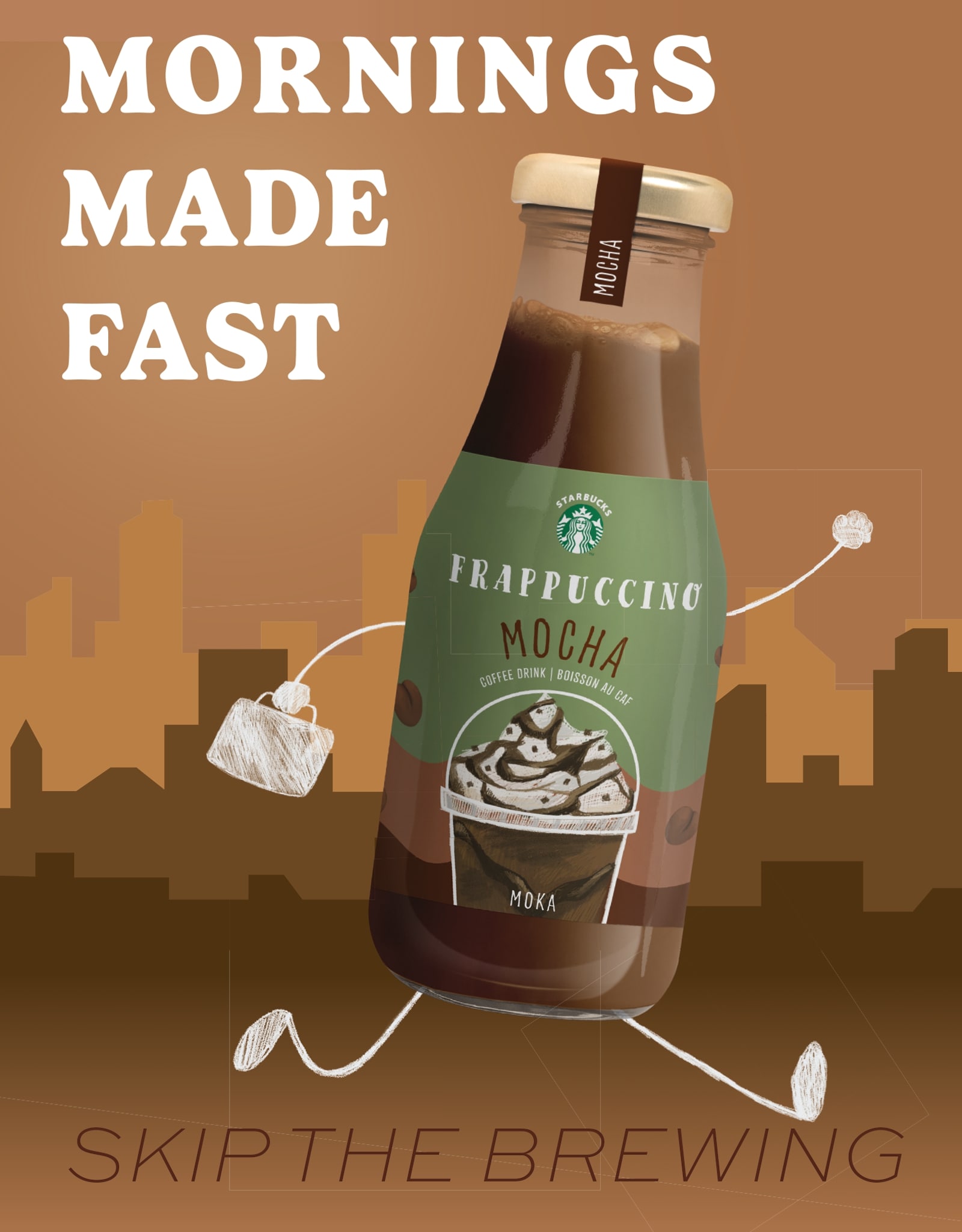
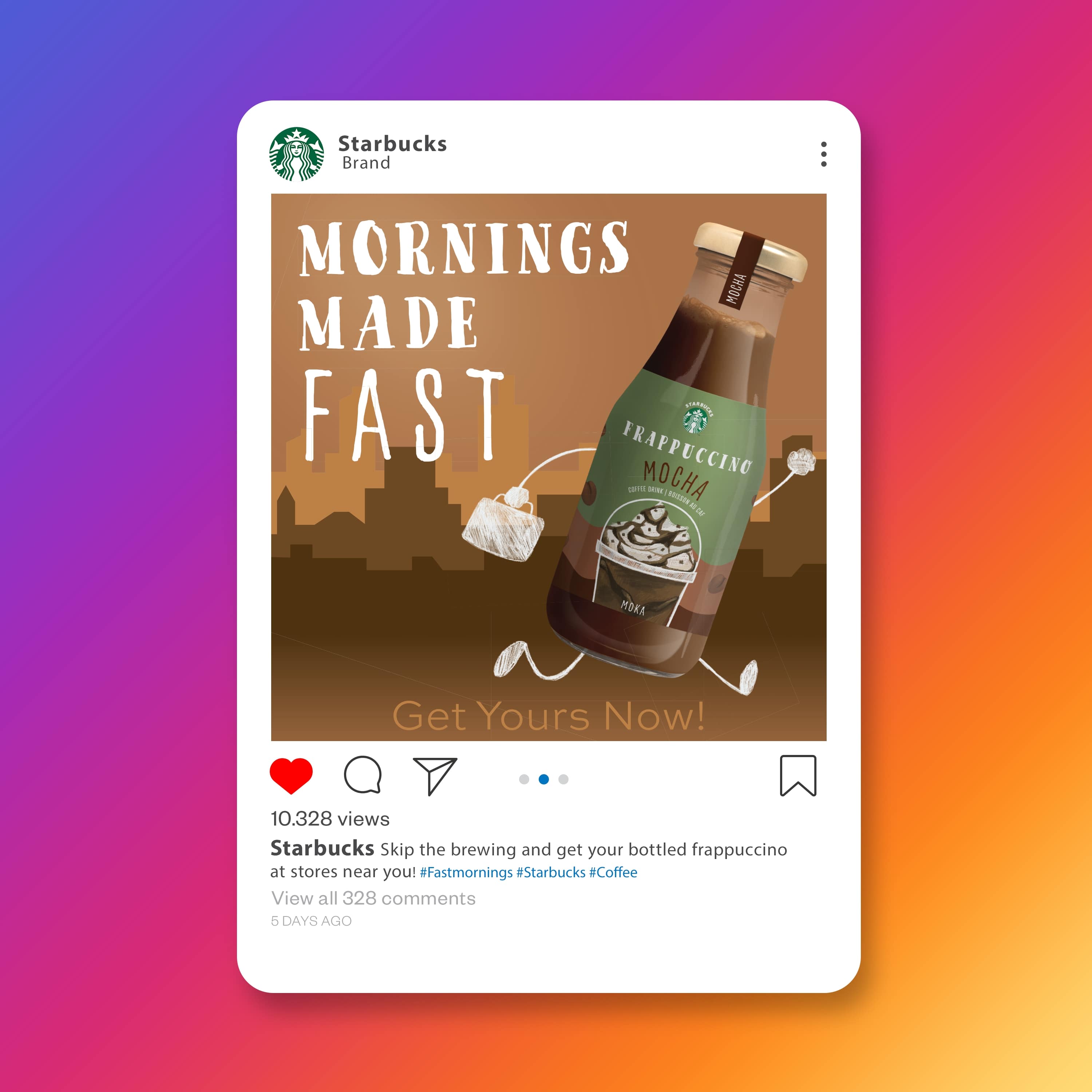
For the beverage rebrand project, I decided to go with Starbucks' bottled Frappuccino. The target audience consists of urban city based individuals, who enjoy warm ambiences and loyalty to the brand.
The redesign incorporates organic colours, and visual appeal to show what a Frappucino looks like. Use of imagery gives a more delicious appeal, as well as hand-written fonts for that cafe blackboard effect.


.jpg)
